Brand
Logos and Assets
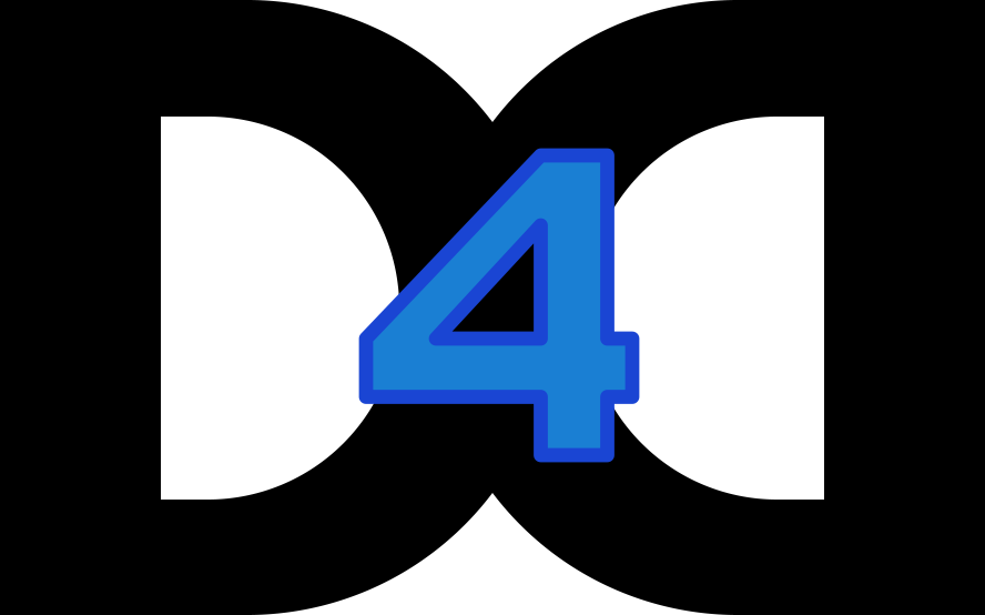
A D and a mirrored D, overlapping, with the 4 standing in the lens they make where they cross. Take what you need, and if you want a format that is not here, ask.
The Mark
The D’s are drawn in the current text colour, so they are black on paper and white on a dark surface. The 4 keeps its own two blues, which hold on either ground.
- mark.svg
The current artwork. The D's are painted in currentColor, so the file works on either ground.
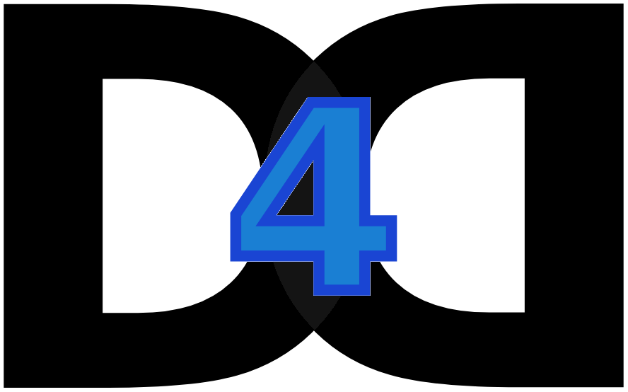
- logo_light_theme.webp
Raster, 888×554, transparent. Black D's, for light grounds and for anywhere SVG is not an option.
- original.webp
The earlier artwork, kept for reference. The D's sit at a very low opacity, so on a pale ground almost nothing of them survives.
- Artwork size
- 888 × 554, landscape
- Formats
- SVG, WebP
- Smallest use
- 20px tall
- Clear space
- The width of the 4
Construction
Clear Space and Minimum Size
The two bowls meet at a point above and below the numeral. Shrink the mark far enough and those points close up, at which stage the D's are gone and only a 4 is left.
Clear space
Keep at least the width of the 4 clear on every side. No rule, no second logo and no edge of a photograph comes inside that.
Minimum size
20px
28px
40px
20px tall is the floor. Below that the outline and the fill merge into one blue shape and the bowls stop reading as letters.
Colour
Two Blues, and Whatever the Text Is
The mark carries two fixed values and inherits the third. Those two are the only hardcoded colours on this site, because they are artwork rather than theme.
Mark blue
#1A7FD3
The fill inside the 4. A fill, not something anyone has to read.
Brand blue
#1A45D3
The outline around the 4, and the value --brand is sampled from.
The deeper of the two is the one the site’s accent is sampled from. It is also the one that clears text contrast on white; the lighter blue is a fill in the artwork and is not used for anything anybody has to read.
Please, and Please Don’t
Please
- Scale it proportionally, by height. It is landscape, not square.
- Keep clear space of at least the width of the 4 on every side.
- Put it on white, on near-black, or on a quiet photograph.
- Let the D's take the colour of the text around them.
Please don’t
- Recolour the 4, or drop the whole mark to greyscale.
- Add a shadow, glow, outline or bevel.
- Stretch, rotate, skew or crop it.
- Set it on a busy image, or on a mid-blue that swallows the numeral.
Need Something That Isn’t Here?
A horizontal lockup, a one-colour version for print, or the mark at a size that is not in the set. Ask and we will send it over.